

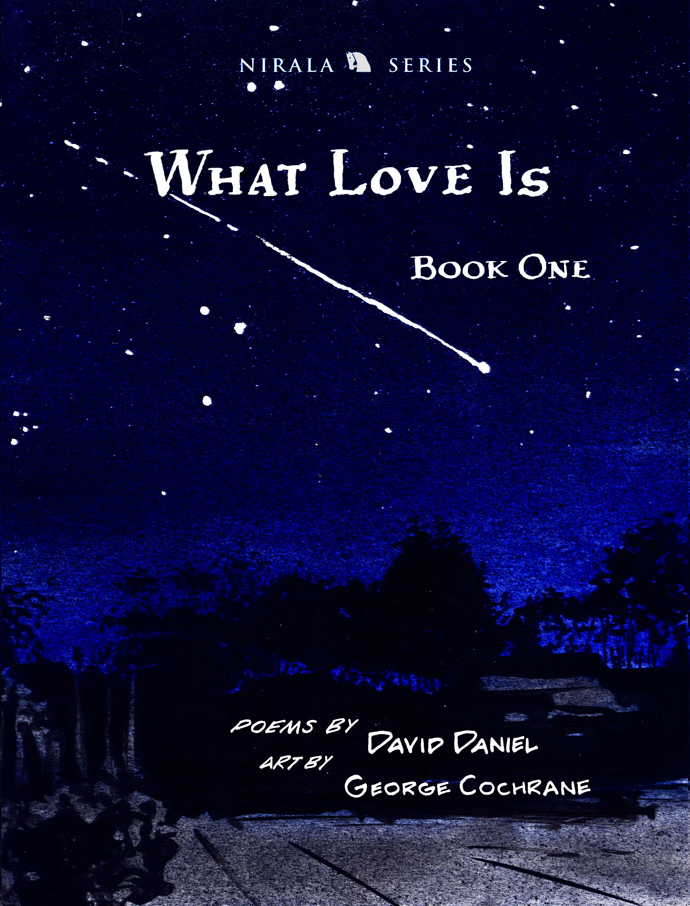
I’ve enjoyed writing here in previous posts about my collaboration with poet David Daniel on our new book, What Love Is: Book One (links at bottom).
If you enjoy this one, I hope you take a look when you reach the end. Or, if you want to start with our curious origin story, maybe head there first.
In any case, you’re here now: at the first in a series of posts that takes a step-by-step look into my creative process by focusing on an individual poem. This one covers what may seem like odd terrain, at least as far as trying to explain my work goes, as it charts what went into making the art for this poem-cum-graphic-novel. It goes a little out there at times…
Buckle-up, there will be rabbit holes.
And lots of pictures.
There’s some backstory and a few general topics to cover before getting into the nitty-gritty of “Coyote.”


In August of 2023, I received at text message from David with a new poem “Coyote,” he’d just finished, one that wasn’t in the original What Love Is manuscript. He asked if I thought I could do something with it. At this point I’d used a number of different approaches to illuminating David’s poems, including turning them into short graphic novels. “Coyote” is so immediate, cinematic, and full of its own dark gravity that it instantly topped my “to do” list. This action-packed poem demanded all the storytelling drama I could muster. The graphic novel was the obvious choice.
At the time, I was at work on my first poem-as-graphic-novel, “White People Trying.” Importantly, I’d developed David’s first-person voice as coming from the “sanguine narrator,” and the character motif would continue in “Coyote.” Here he is in “White People Trying.”


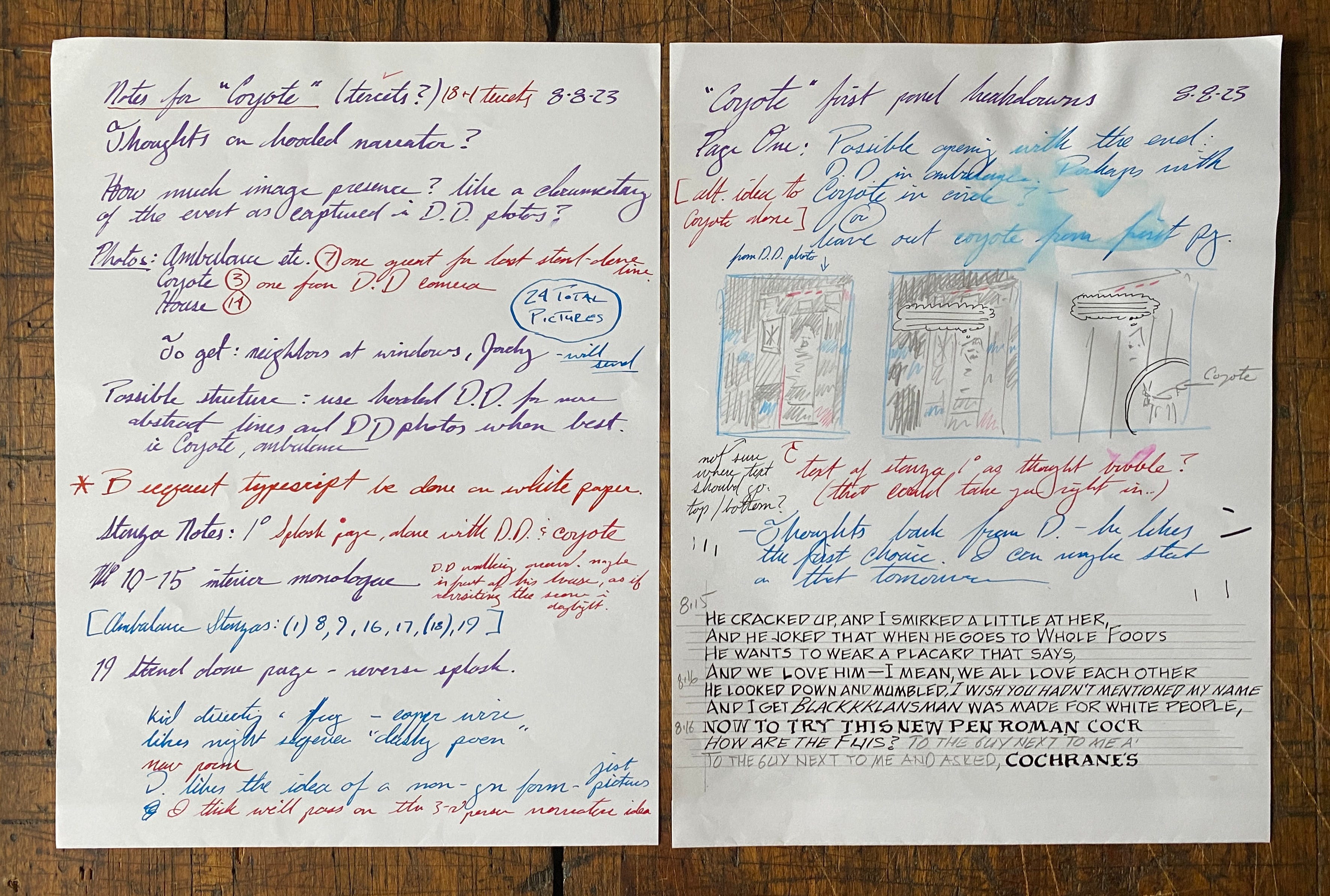
You can see from these first notes, made more than a month before work could begin in earnest, that I already had a notion of what page one might look like (see pencil thumbnail sketch).
[Note “timestamp” practice lines from “White People Trying.”]
Writing out the longest lines allows me to measure their lengths in preparation for lettering the final page. It doesn’t always work out though, and I have to do multiple takes.


On principle, I try to refuse digital manipulation to “correct” my work. That is, when I spot a mistake, I don’t think to myself, “I’ll have that fixed in post-production.” It needs to be right on the page. I see it as my job. For me, it’s what I leave behind on the piece of paper that matters more than creation of an even more fugitive digital file. If I catch it in time, I’ll start the page over. The corrections I allow are mostly for spelling mistakes or distracting stray marks.
That said, as long as a real person makes the work, there will be “mistakes.”
I’m cool with mine.
On September 22, 2023, David sent me his finished poem.
I loved it. I wanted to get right to work, but I don’t have a printer at home. So I wrote the poem out by hand. Twice.


I could have sent it to a copy store for a printout the next day, but I learned making my Divine Comedy that copying a poem makes for the best first encounter. It’s like I’m putting the words into my body in the act of writing. It’s then that I can see their shape, read their rhythms, and learn how the poem fits on the page: writing as drawing/drawing as writing.
A line from Edward Albee’s Zoo Story comes to mind, “Sometimes a person has to go a very long distance out of his way to come back a short distance correctly”.
Sidebar/tangent on where I put the words:
Bob Dylan was once asked the kind of stupid question he’d become accustomed to during a televised press conference in San Francisco on KQED (12/3/65).
His beguiling, if somewhat bemused, answer somehow resonates with me.
[at 3:12] The criticism that you have received for leaving the folk field and switching to folk-rock hasn’t seemed to bother you a great deal. Do you think you’ll stick to folk-rock or go into more writing?
I don’t play folk-rock.
What would you call your music?
I like to think of it more in terms of vision music—it’s mathematical music.
Mathematical music.
Once in a while, I think I catch a glimpse of what he means.
In music everything has a place in measured time. Notes have to fit. There’s math in that. In visual art, things have to spatially fit. In part, I’ve always approached finding the poem’s place on a page as a mathematical process. It involves measuring and counting the letters, lines, and stanzas to get a handle on its shape.
My previous experience with poetic page design came creating my Divine Comedy. I settled on its text form by looking at 13th century manuscripts of the poem. I kept the text block as a whole, dividing it only by its tercets. Thus potential per-page line totals are all factors of three. Math.
Learning that forty-two lines per block is common made my choice easy (see Douglas Adams).


With David’s blessing I was free to explore different layout designs for his text in What Love Is. The only rule for myself was that I wanted to preserve a sense of his original poetic form. “Coyote” is in eighteen tercets, plus a single final line. I plotted them over fourteen pages with stanza and scene breakdowns.


David and I frequently discussed the poem at length by phone, text message, and email. I always asked for pictures.
I require images to work. For me, if David goes to the trouble of placing his work in a certain location, or even if he’s thinking of specific place as he’s writing, then it’s my job to get the details of the place right as much as possible. I need photos for all the things that I can’t make up. I do that by working from an abundance of images.
“Coyote” begins with a bang.
David’s in an ambulance.
Incredibly, Jordy Oakland, David’s wife, captured these moments amid the unfolding drama.
(Spoiler alert: David remembers almost dying, seeing a coyote in his yard, and saying goodbye to his wife.)


But to get the whole action sequence right, I needed more. More pictures.
Artist Jack “King” Kirby, creator of most of the Silver-Age Marvel Universe, once said that being a comic book artist is like being a film director with an unlimited budget. I always liked that.
In these moments, I get to play “film director” by asking David to make photo reenactments the poem’s scenes. This wasn’t the first, or last time I’d ask David and Jordy to revisit his poems’ settings with a camera. They always come through.
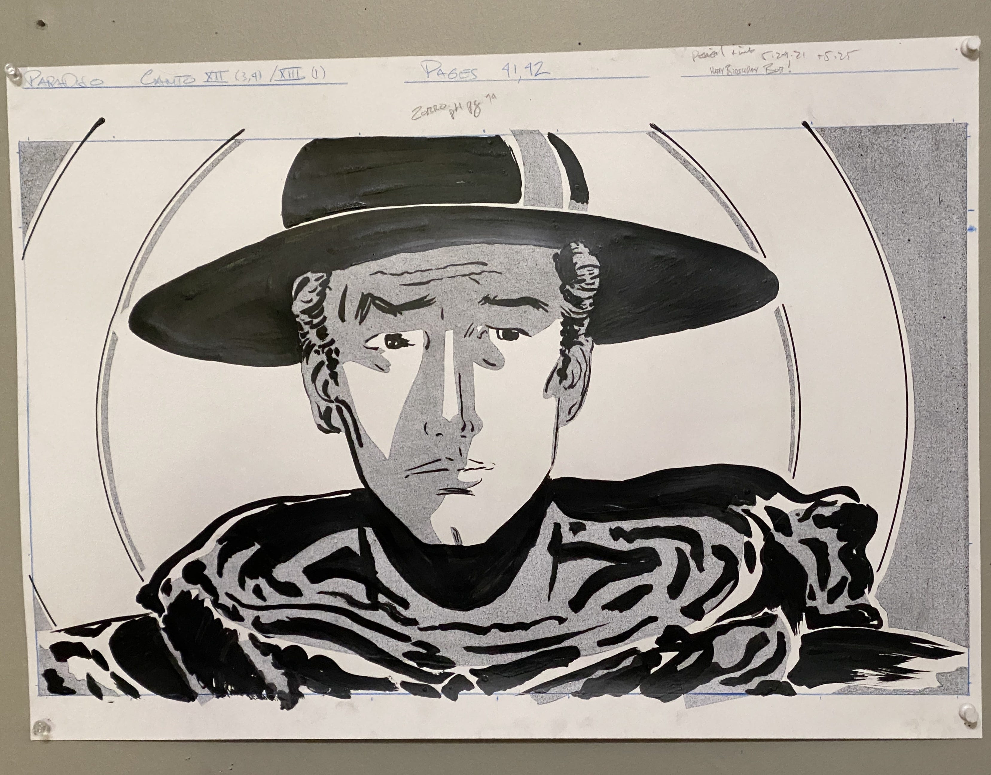
When I though about the look of “Coyote,” I was instantly drawn to a stark black and white world. By adding a grey tone, I could create more spatially complex panels. Alex Toth’s Zorro is one of my models for this approach.


I’d already borrowed from his Zorro for my “Paradiso.”
[N.B. drawn on Dylan’s birthday, with a note.]
The materials I use here are Sennelier India ink and sanguine watercolor on twelve by nine inch Bristol paper. I make the watercolor paint by hand from pigment Ocra rossa - Sinopia (Red Ochre) from Zecchi, Florence, Italy.


Sennelier makes the only India ink I’ll use. There’s shellac in their recipe, and it makes all the difference (R.I.P. Steve Albini). Most inks penetrate the surface, staining the paper. Shellac imbues the ink a slightly thicker, more viscous “body,” resulting in it sitting on top of the paper more, with little penetration and subsequent staining. The practical upshot is that when I make a mistake I can (mostly) scrape it off, effectively erasing the ink. Which is impossible with most inks.
Here are my scratching nibs, each with its own shape for different purposes. The pointy one on the left is great for tiny work, like on a single letter.
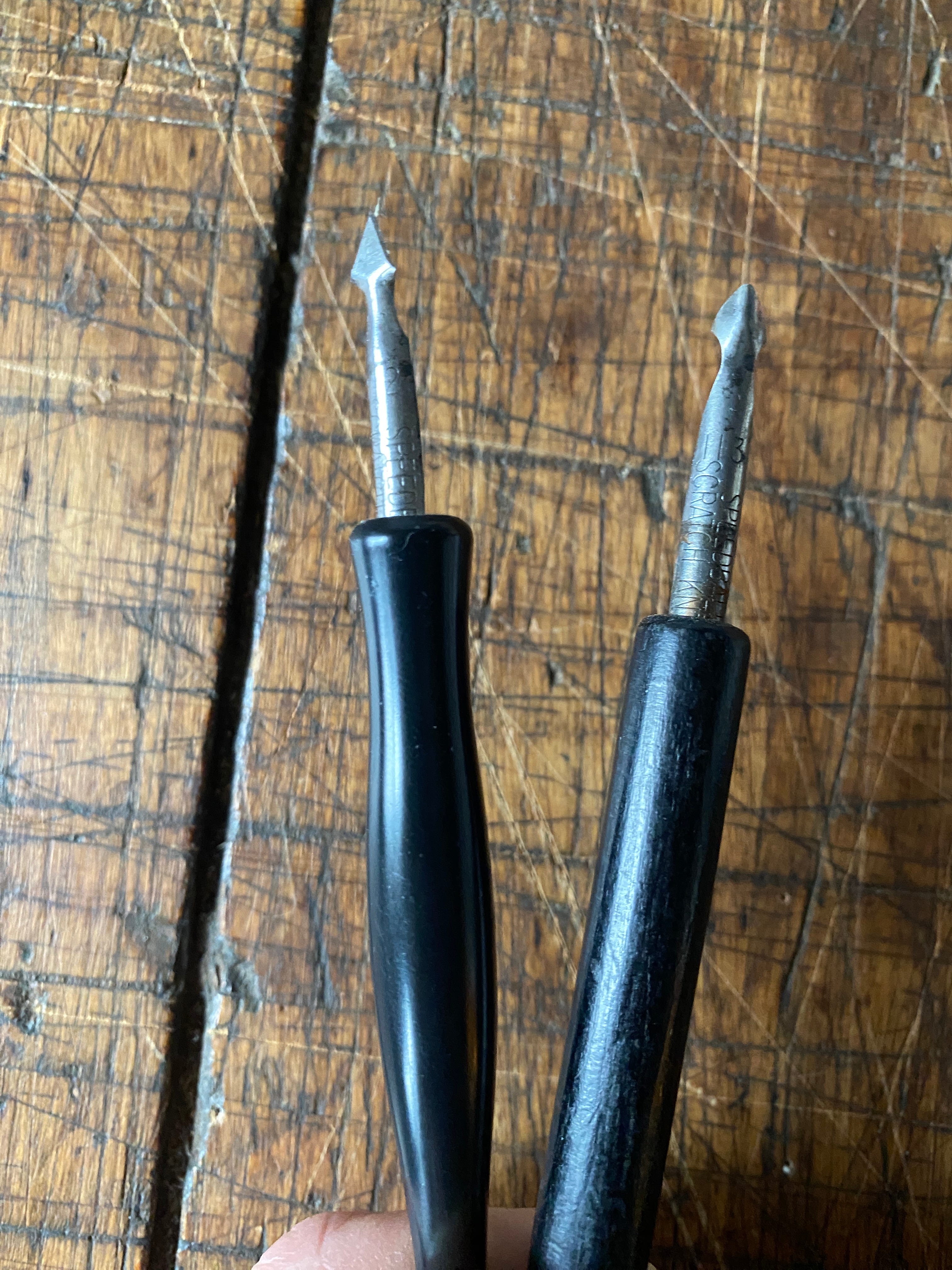
The more rounded, scooped tool on the right is gentler on the paper and works well for larger areas. Here it is in action with a design eraser (sound up).
To be honest, this video is a little hard for me to watch.
Ouch!
The paper gets more damaged than it would if it were India and not fountain pen ink. But this is from my Divine Comedy manuscript, and I’m writing with a fine-nib Pelikan 101N fountain pen. This is problematic because after the paper is harmed and its fibers “open up,” it draws liquid in faster than if it was undamaged. Which means that the ink will uncontrollably “bloom” sideways into the paper, leaving a big ugly mark that will actually draw attention to the mistake. So the solution involves removing as little of the first layer of the paper as possible, then writing or drawing lightly and fast, without hesitation. Anyway. Enough shop-talk.
Here’s where the page development begins, with source photos. Here’s the first, or “splash” page.


Page two and three are composed together, and feature the “sanguine narrator.” We see him in his own isolated panel at first, and then appearing in the last panel to view the B&W scene he’s recounting.


The sanguine narrator remains out of the signature round panel on page four, and is seen in full panels as the narrative focus shifts to David telling the story now in front of his house.


Page five has the sanguine narrator outside his house, viewing the flashback scene in B&W.


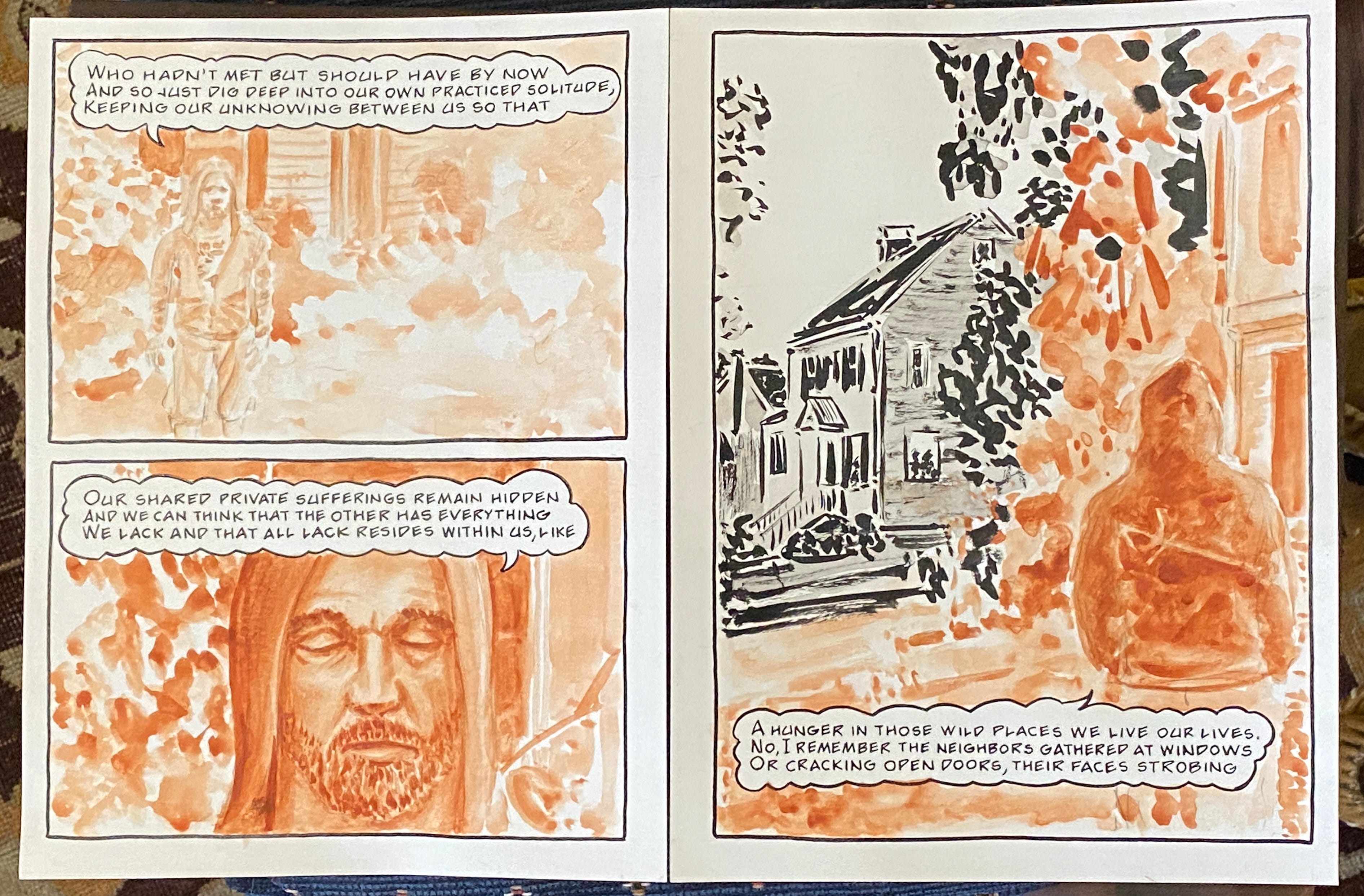
[Pages four & five together.]
Pages six and seven make a single full-bleed composition. Haunting, as David watches himself get carted out of his house on a stretcher.


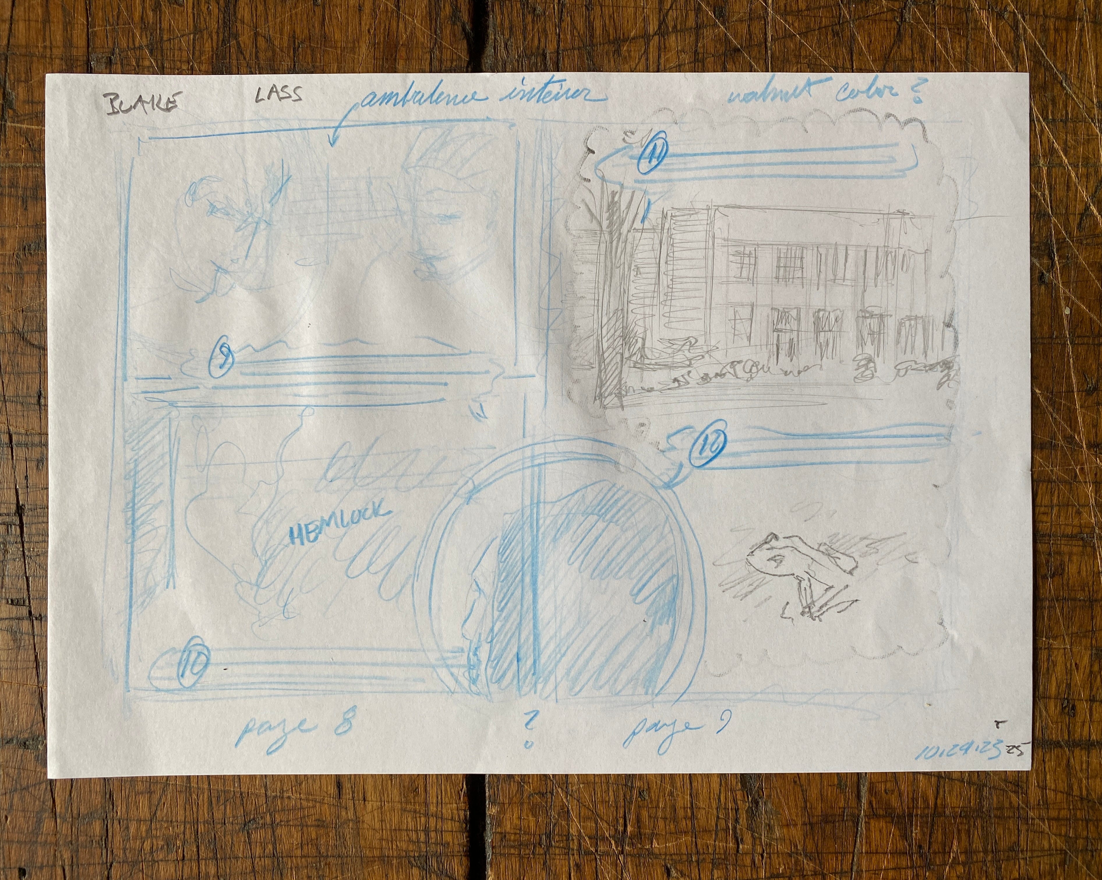
Pages eight and nine is a complicated layout as the sanguine narrator introduces another timestream: his childhood. Here’s a first thumbnail of a possible page design.
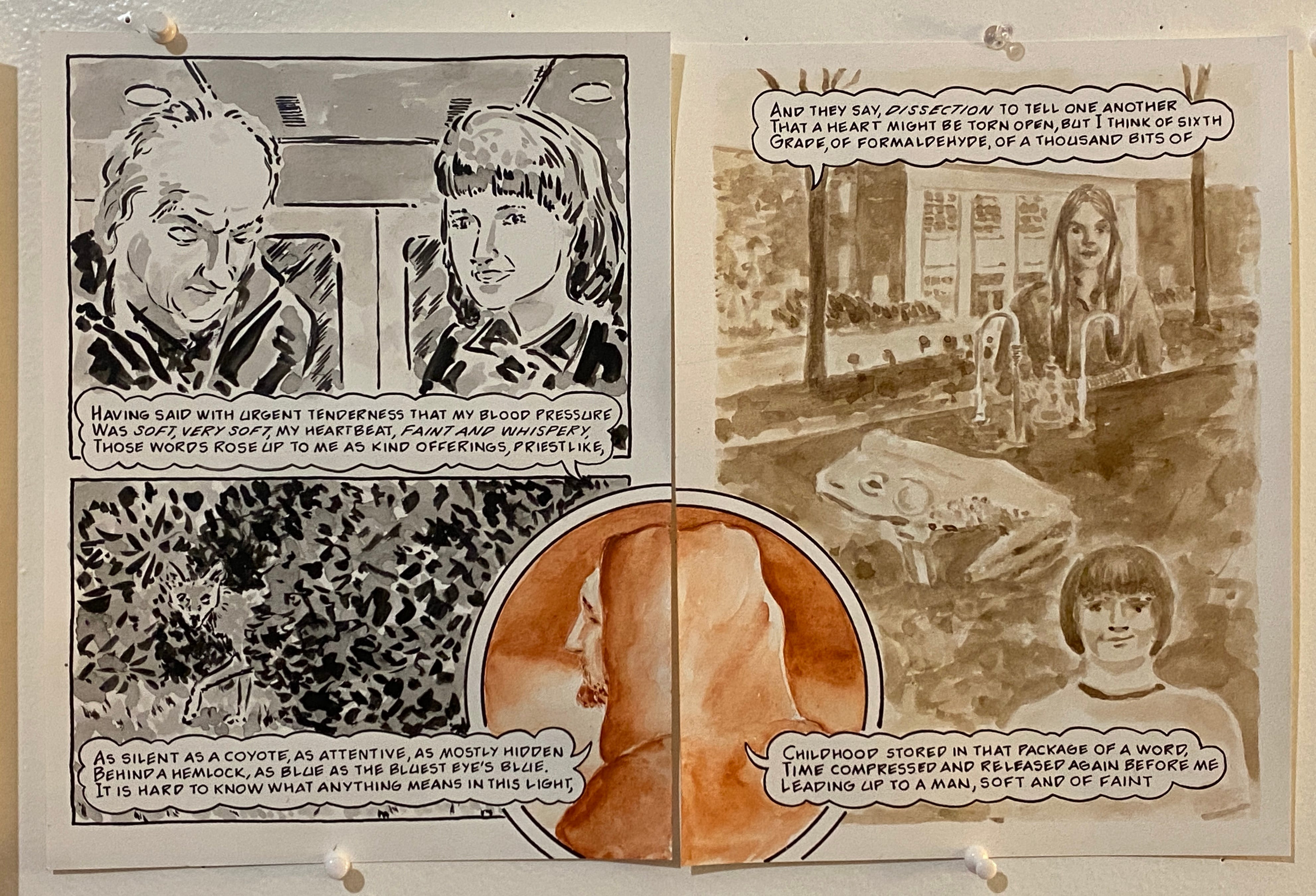
The ambulance ride has David interacting with the E.M.T.s, and I asked David who he’d like to see taking care of him. Who were his heroes? He answered, William Blake and an old friend of his who’d proved to be a lifesaver years before. David sent me some reference photos and I looked for pictures of Blake. I found these.


The coyote was drawn by placing this photo behind David’s shrub.


The poem flashes back to scenes from David’s high school. To suggest another moment in time, I switched materials to walnut ink. I’d never really used it before “Coyote.” I had an idea about how it would look, but as always, I had to do tests to see. Here’s one with David’s yearbook and frog source photos.


How the pages came together:


Finished pages below.


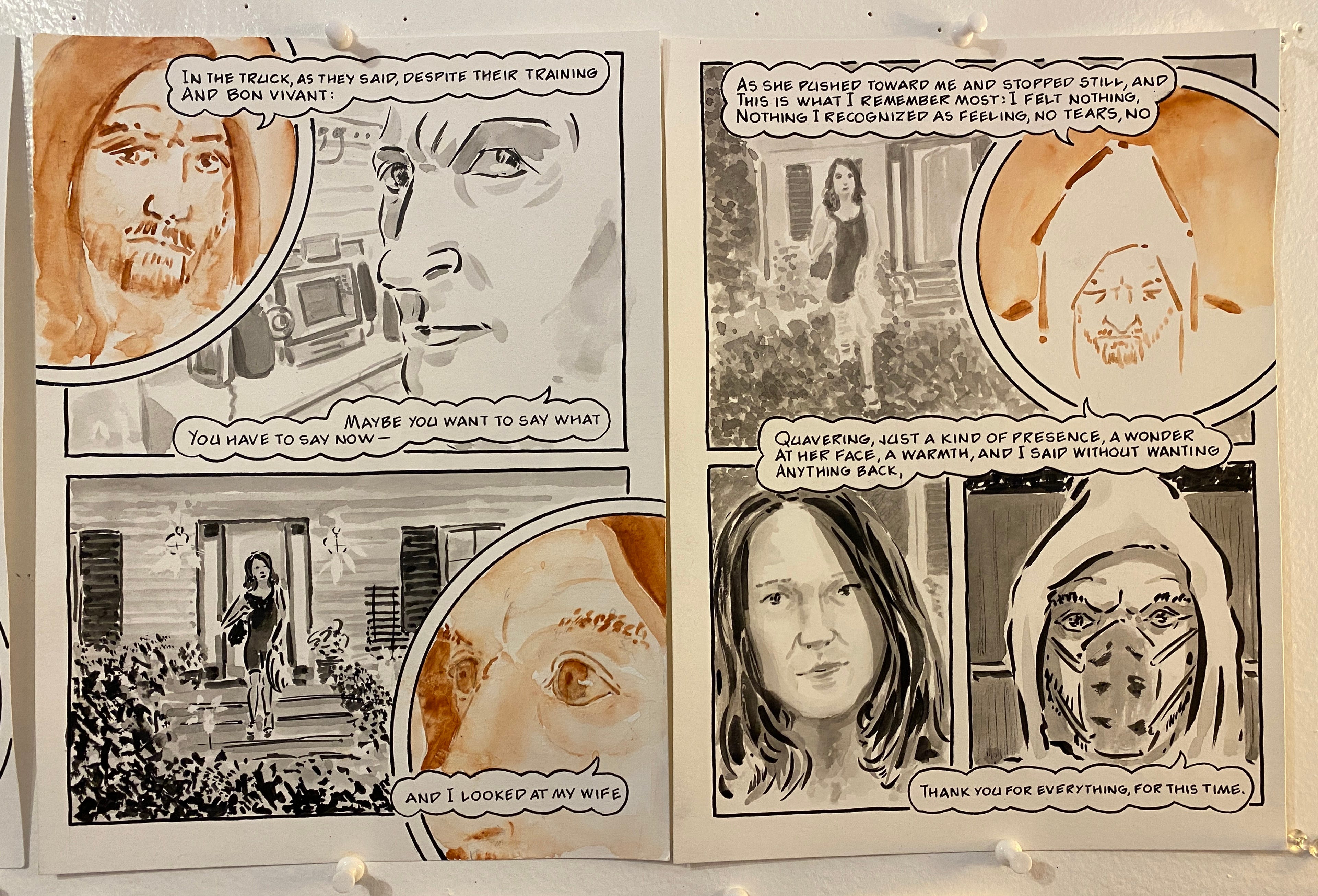
We return to the “sanguine narrator” relating the most dramatic exchanges with Jordy. Blake’s there again, too.


Penultimate pages, finished. Now for the final page with the poem’s last line. I add the sound-effects.


Here’s the complete poem from studio photos.


The published edition of What Love Is: Book One includes a commentary that David and I wrote about each poem.
Here’s my entry for “Coyote”:
“I wanted to preserve the poem’s inherent noir-ish qualities by using a stark B&W approach (despite references to colored lights in the text). Here, and wherever they appear, the hand letters are done with a dip-pen with a Japanese nib using Sennilier India ink. The same ink is used in all the artwork, unless otherwise noted.
Against this black and grey-tone landscape, I use a visual trope found throughout What Love Is: the image of David now in a hoodie and music-themed T-shirt, painted using artist-made sanguine watercolor with pigment sourced from Zecchi. The T-shirt becomes an often humorous, narrative leitmotif, always somehow related to the content of the verse. In this case, I thought of Joni Mitchell’s masterpiece “Coyote” as a play on the title. David is a big fan. The image at his suggestion comes from the inside of the gatefold LP of Court and Spark, on which “Coyote” does not appear. His hoodie has the symbol of Shakespeare & Company. David becomes Dante among us, and the specificity of the painting material calls up the ghost of Michelangelo. This while providing a visually distinct narrator to address the first-person nature of many of his terzine.
This poem employs walnut ink for the “flashback” montages of real-time photos, reenactments, high-school yearbook photos, and internet searches. Here the walnut ink visually recalls the past with its brown tone resembling the iron gall ink used by artists such as Rembrandt and Da Vinci. Thus, the three materials indicate distinct moments in time: childhood in walnut, the recalled drama in B&W, and the present-day hooded narrator/observer in sanguine. On the fifth and sixth pages of the poem the sanguine narrator is no longer in an isolated panel but witnesses the dramatic scene in media res. This represents my attempt to visually depict the simultaneity and the shifting, movable backdrop of David’s poems.”
If you liked this post, please comment, share, and subscribe for more deep-dives into the poems that make up the forthcoming What Love Is: Book One.
If you missed the “David and George backstory,” check out the posts below, and thanks!
What is love?

What is What Love Is? The short answer is that it’s a long story. A story that begins with a friendship that began more than a decade ago at Fairleigh Dickinson University in Florham Park, N.J., when I met fellow professor David Daniel.
What is love?

[Continued from “The story of What Love Is: Book One (part one)”] The story picks up when I met Dante. In 2014 my work on Long Time Gone shifted to the back-burner, temporarily displaced by the offer to make a new illuminated manuscript of the Divine Comedy